

Ace the Himalaya sells trek and tour trips across Nepal, Bhutan, Tibet and India from offices in Nepal, North America, Europe, Indonesia and South Korea. The catalog was the problem. A traveler may know only that they want two weeks in the Himalaya. The site has to get them from there to one trip.

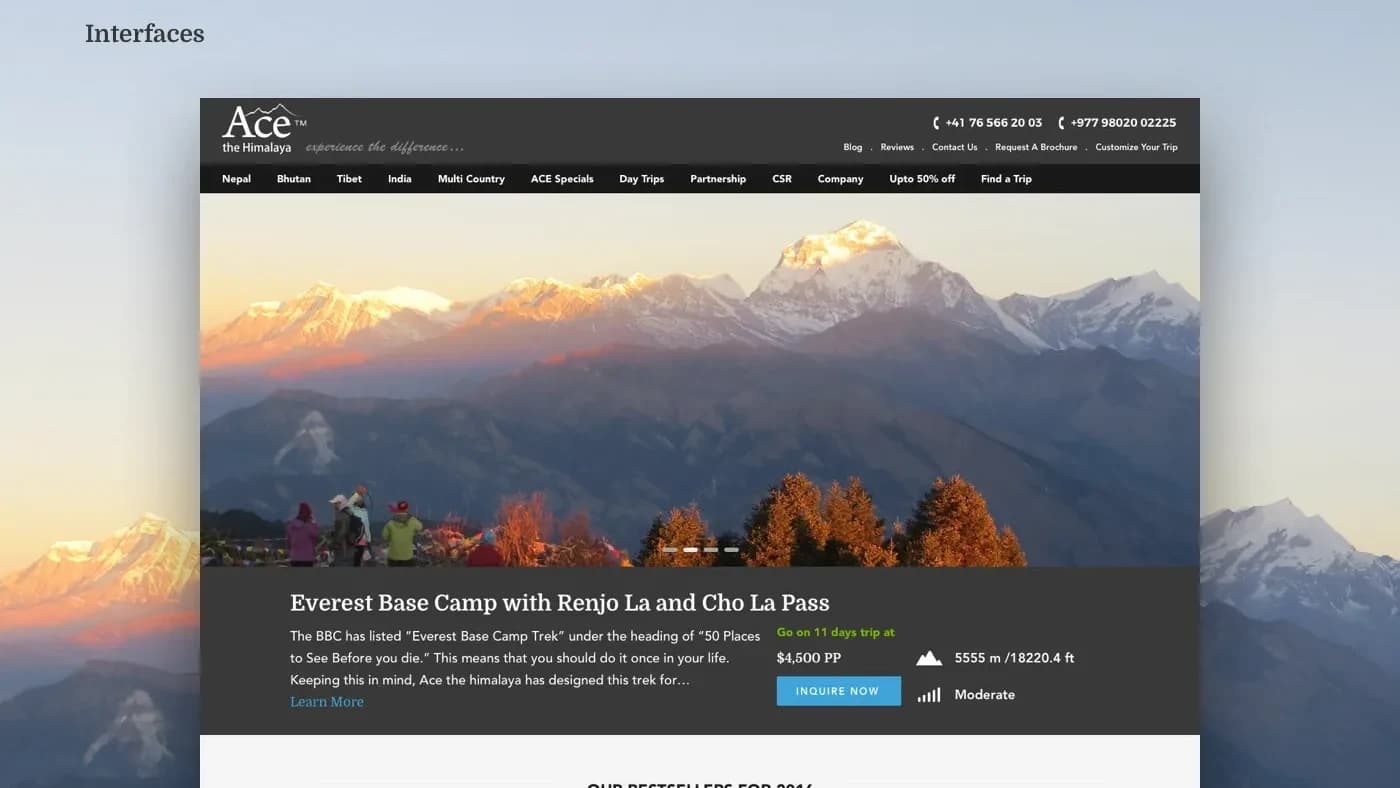
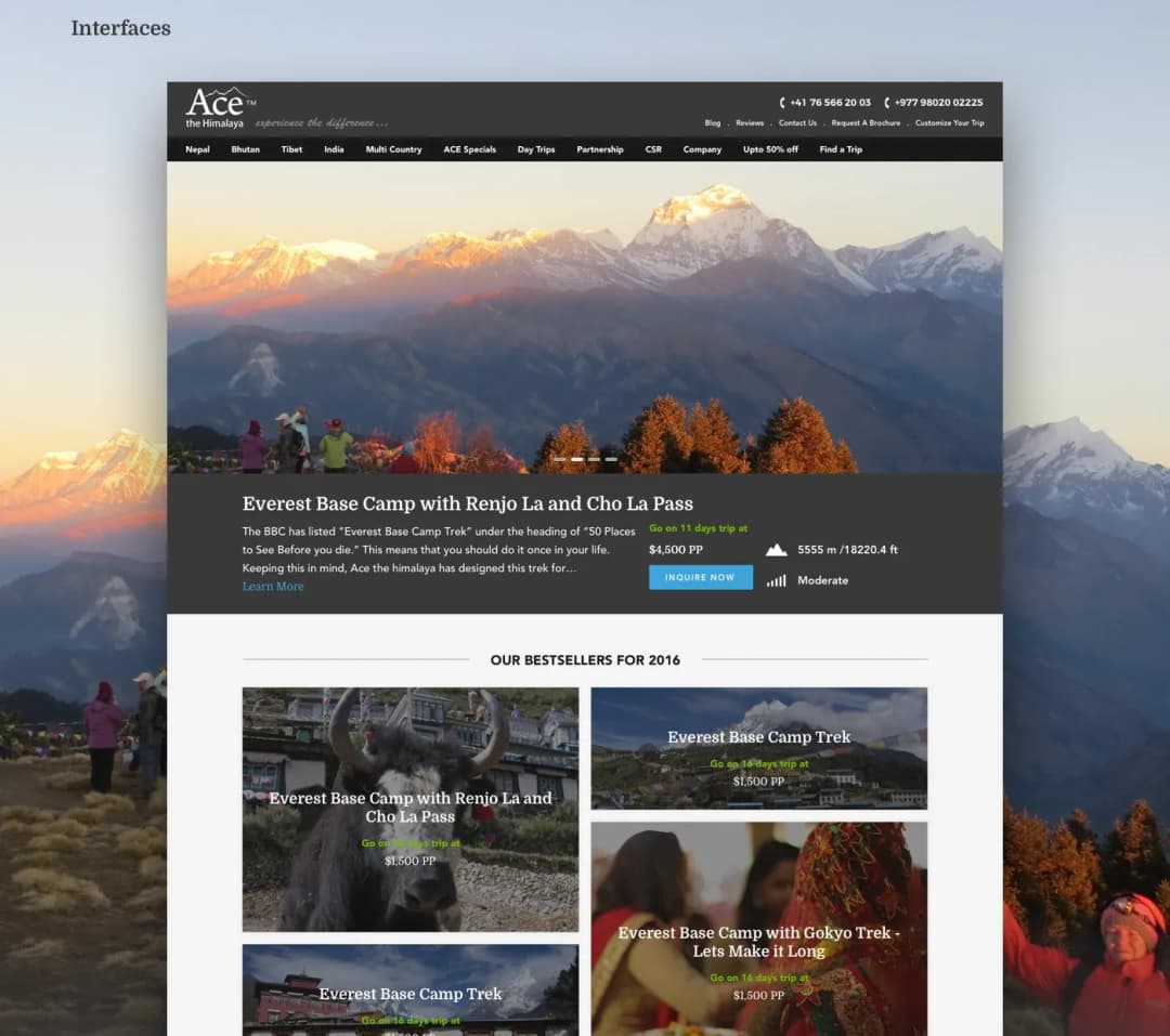
The site as it shipped
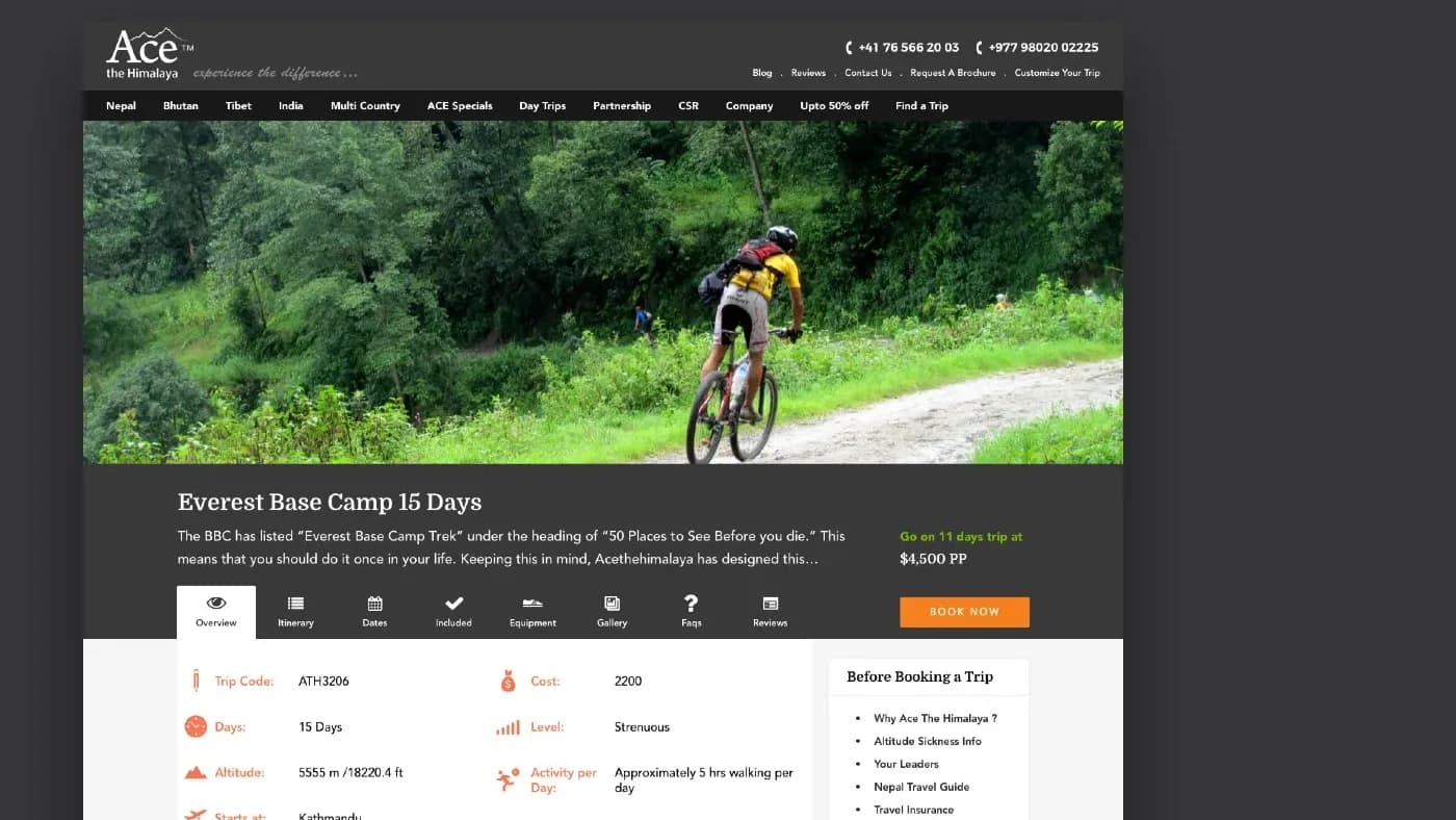
The home page, the trip page and the structure underneath both.
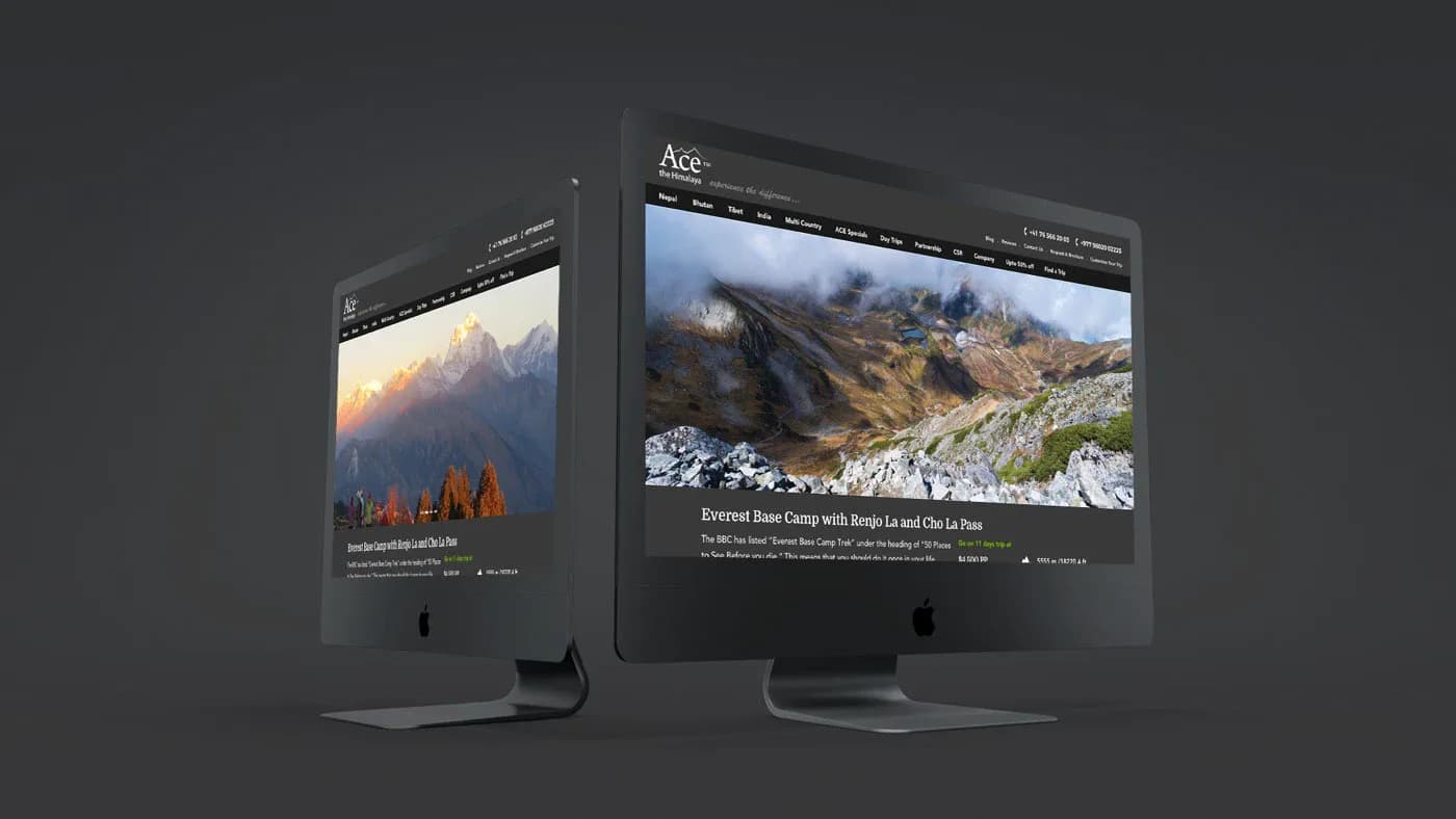
The decision a trekker is making
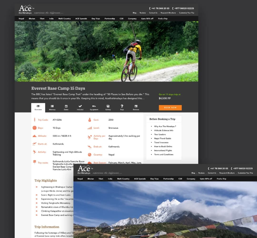
Nobody arrives asking for trip ATH3206. They arrive knowing roughly how long they have, roughly how hard they want it to be, and often not much else. So the trip page leads with the facts that settle it: days, cost, grade, maximum altitude, hours of walking a day, where it starts and where it ends. Everything else sits behind tabs on the same page: the itinerary, dates, inclusions, equipment, gallery, questions and reviews.
Four countries, one catalog
Nepal, Bhutan, Tibet and India, plus multi-country routes that cross between them, and day trips for people already on the ground. The navigation carries the countries across the top and the ways in underneath: find a trip, customize a trip, or start from what other people booked.
Wireframed first, and in detail
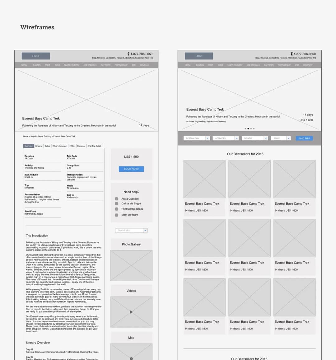
Every template was drawn and annotated in 2015, before anything was designed:
- The home page with its search and its bestsellers
- The trip page with its tabs and its booking panel
- The help block and the offers section
- A footer carrying the trip lists for all four countries alongside the contact details for each overseas office
On a catalog this size, agreeing the shape first is what stops the redesign turning into a rewrite.
A restructure, not a reskin
The company already had a website. What it did not have was a structure that matched how its customers choose, which is by time and difficulty rather than by country and trip name. The work ran in order: strategy sessions, architecture, wireframes in 2015, interfaces through 2016, then the build on WordPress and WooCommerce. The last screens landed in 2018. The site has been running on that structure ever since, at acethehimalaya.com.
Tell us what you are building.
A senior person reads every enquiry and replies within one working day.