

An 18-year-old event platform, redesigned without losing its users
TraqIT builds software for trade-show organizers. Its event management product was 18 years old and losing users to data-entry fatigue. Our design lead ran the redesign: a UX audit and fixes first, a transitional version second, then a task-based product.
- 38%less time on task creation and event management
- 34%landing page conversion for new users
- 18years of legacy product modernized
- 3phases: fix, transition, redesign
TraqIT builds software for trade-show organizers. Its users spent most of every day entering data into an interface that had grown for 18 years. Over half were abandoning routine tasks. The product did not work across devices and carried bugs that turned small jobs into hurdles.
The brief was not a rewrite. It was a transition: modernize the product without alienating a long-standing, often older user base. Our design lead worked alongside the client's design manager, three stakeholders, four engineers and a product manager, with tight budgets and long development cycles as fixed constraints.
Our Role
One designer from LastDoor led the work end to end, from audit to shipped interface.
We provided:
- UX Audit and Immediate Fixes. Broken flows repaired, data fill-ups automated, primary usability issues fixed, and a written audit that bridged the old product to the new
- Transitional Release. An MVP with modern components that kept the layout users knew, built with the engineering team
- Research. Semi-structured interviews with users and stakeholders, one-on-one tests over UserTesting.com and Zoom, multiple rounds of iteration
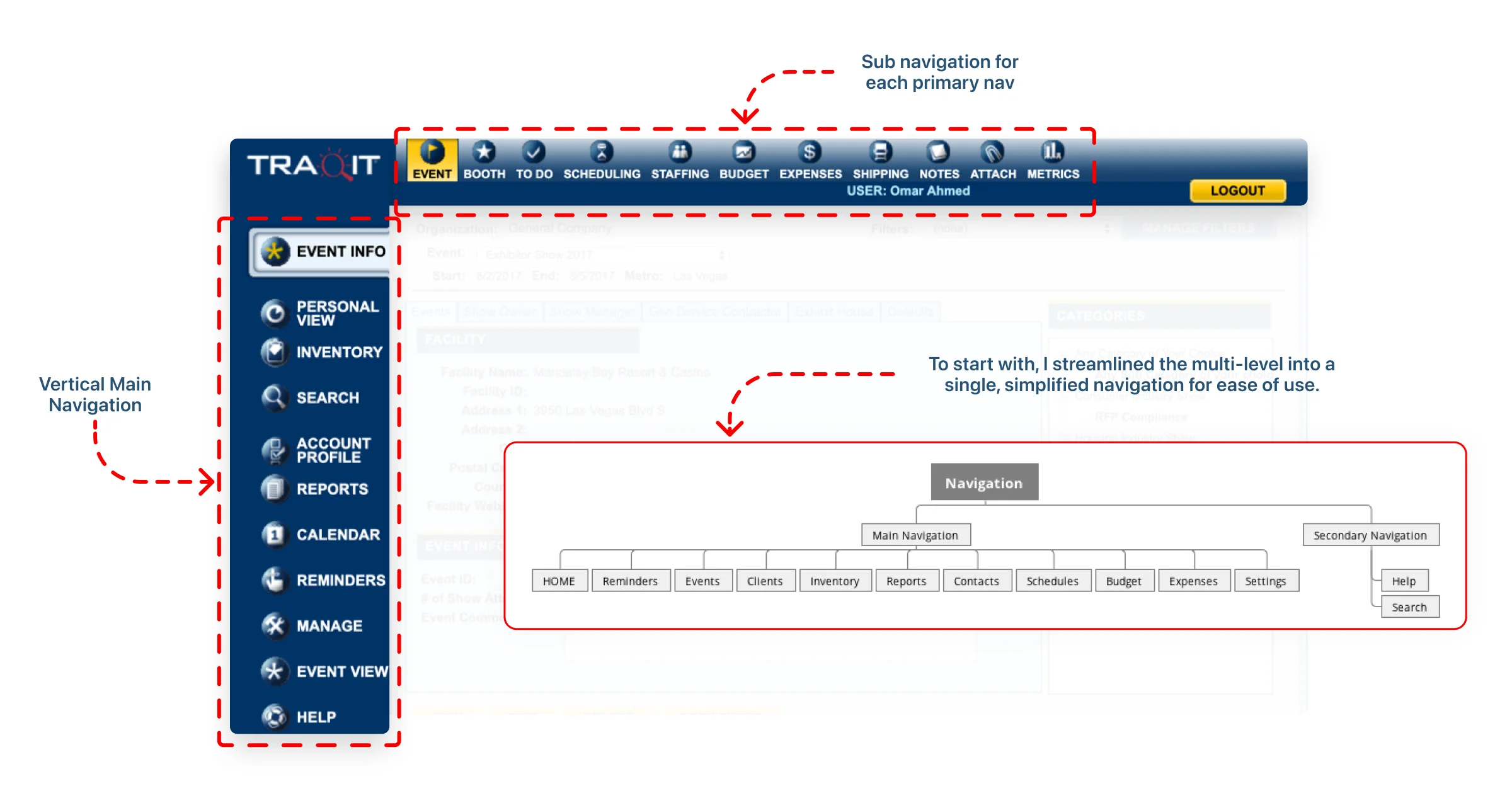
- The Redesign. Task-based interface, event insight cards, customizable dashboards, left navigation reintroduced on user request
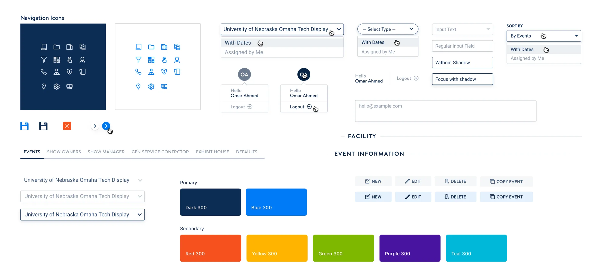
- Design System. Modular components, WCAG-guided accessibility, consistent interactive feedback
How We Worked
We phased the work so users were never stranded between the familiar and the new:
- Phase one: fixed what was broken and documented everything else in a UX audit.
- Phase two: shipped a transitional UI: modern components, familiar layout, minimal flow changes.
- Phase three: reimagined the product around tasks and event insights, tested in rounds with users and stakeholders.
Early testing showed users wanted one clear overview per event, so KPIs moved onto the dashboard. Every iteration went back to users before it went to engineering.
The Design Process
Three phases over five months, each shipped and tested before the next started. The screens below are the client's own interface at each stage.
Where it landed
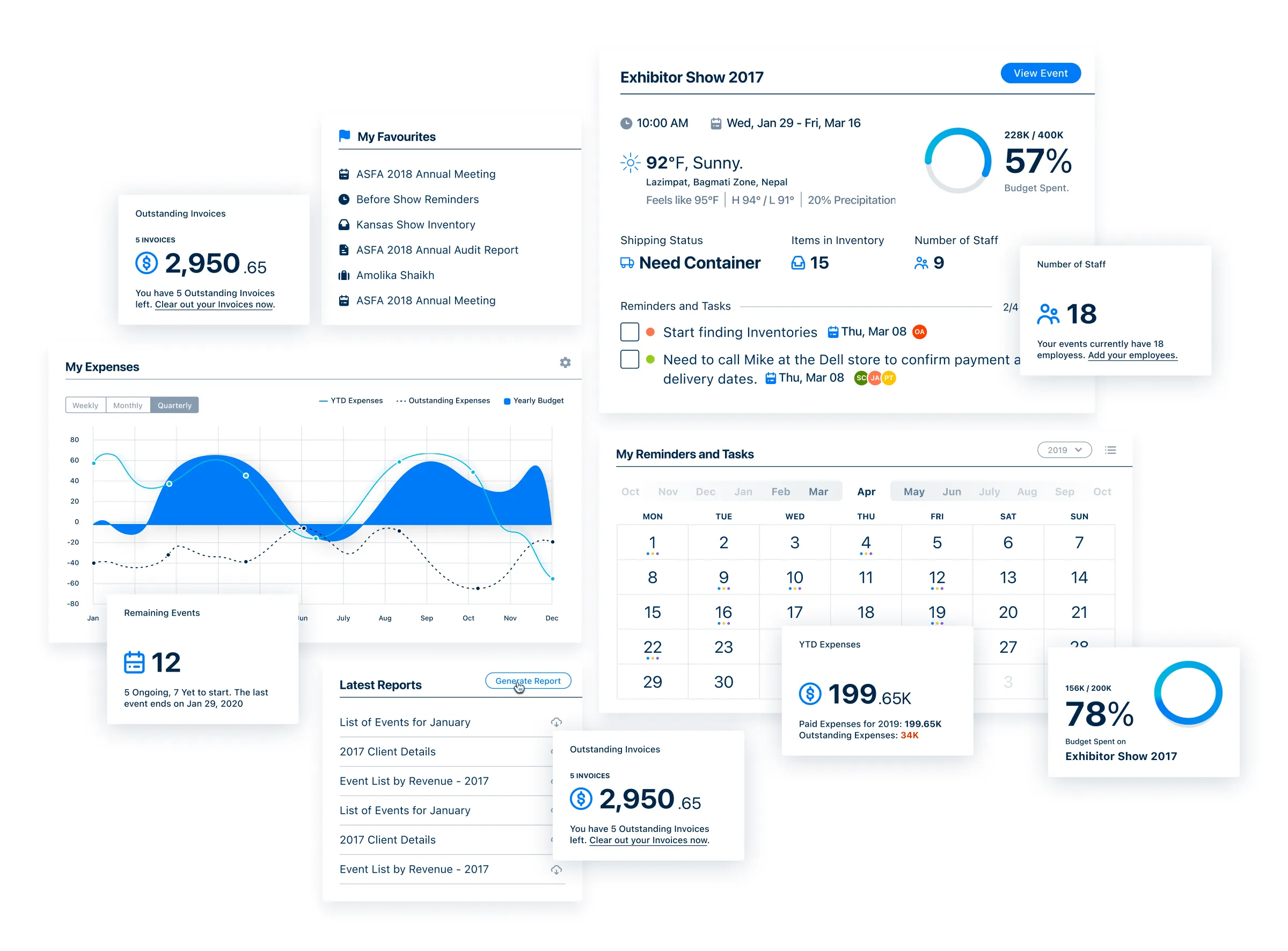
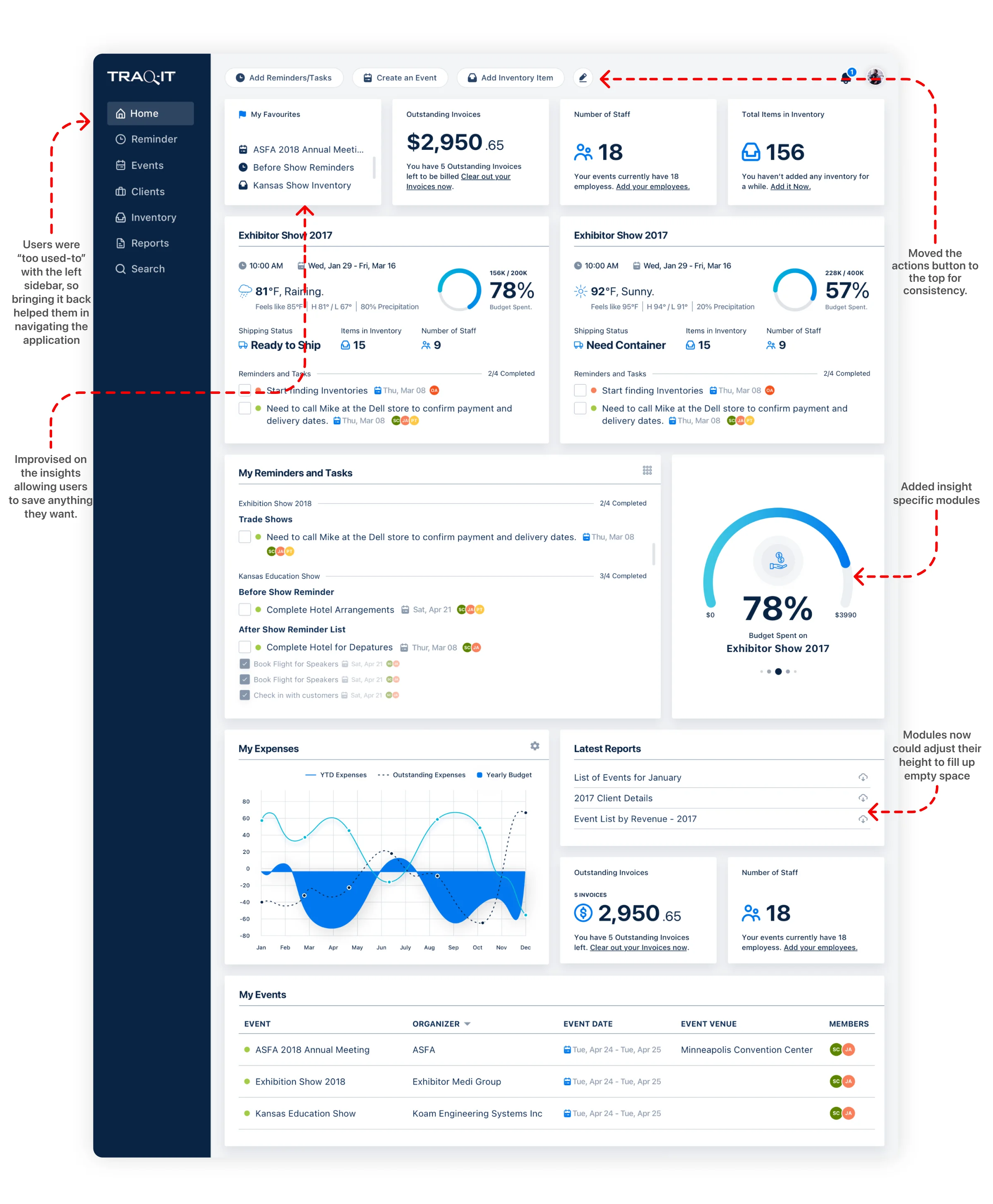
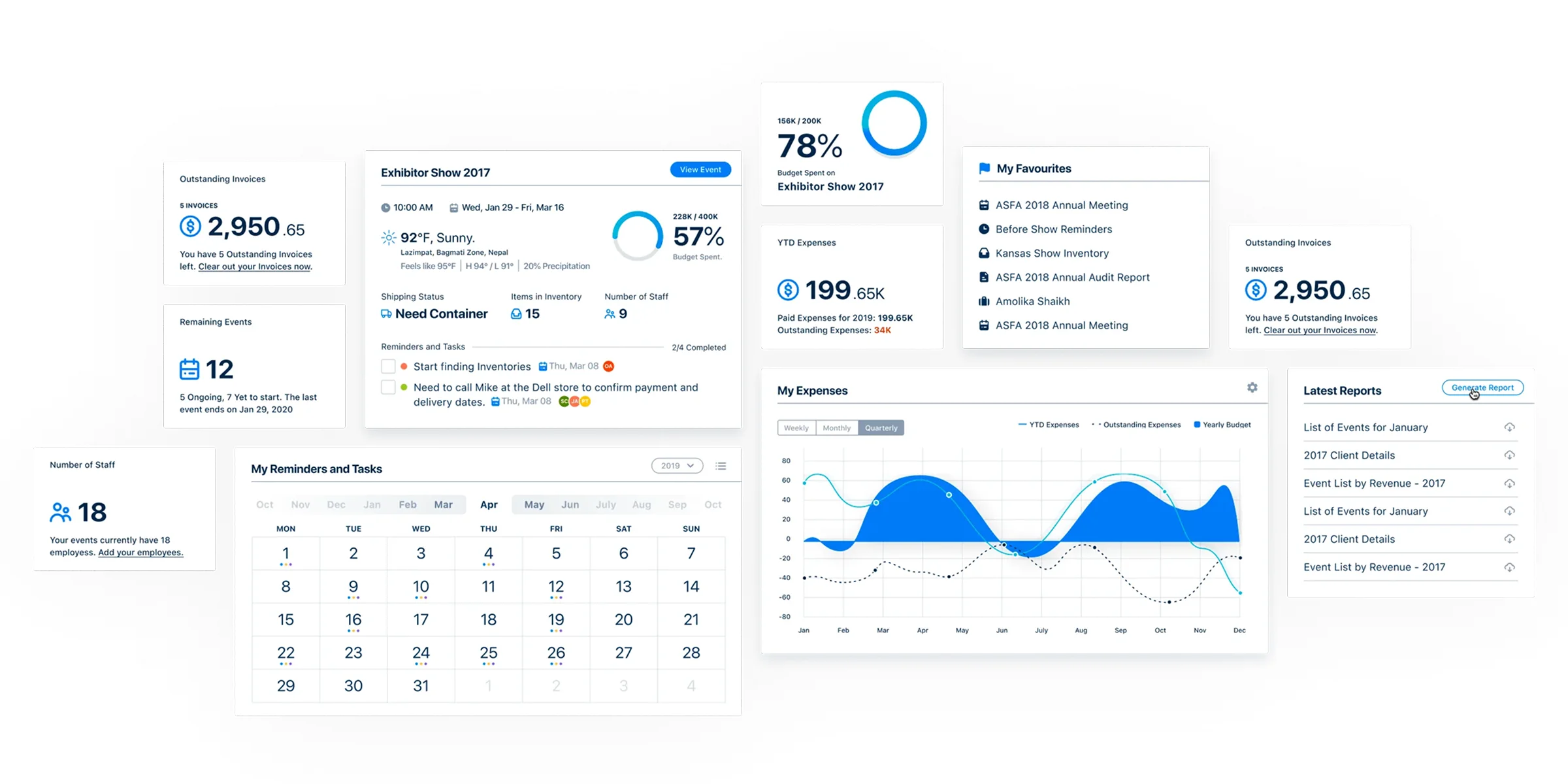
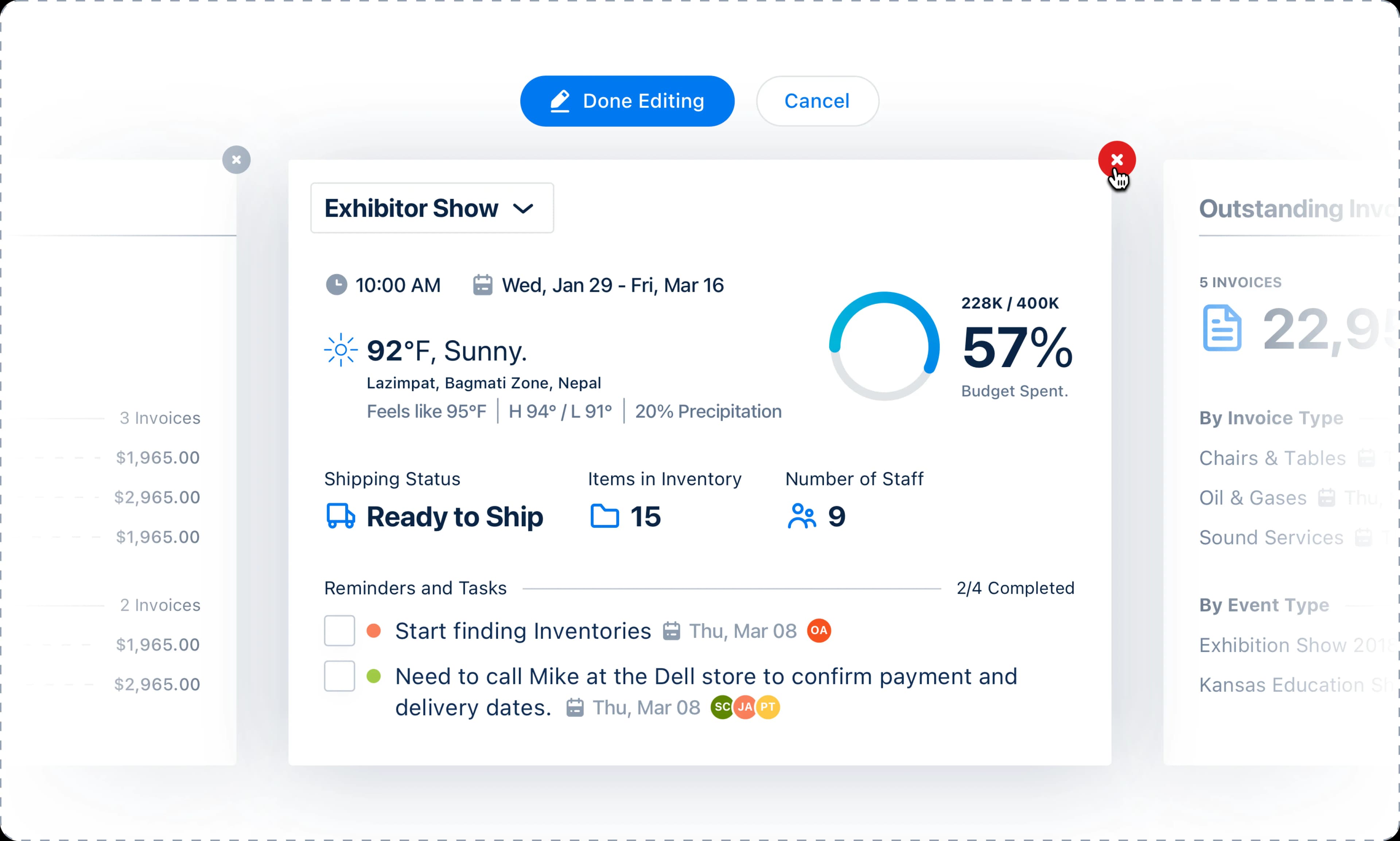
The finished product surfaces the numbers an organizer checks all day. Budget spent, outstanding invoices, remaining events, staff counts and reminders sit on one dashboard instead of behind separate screens.
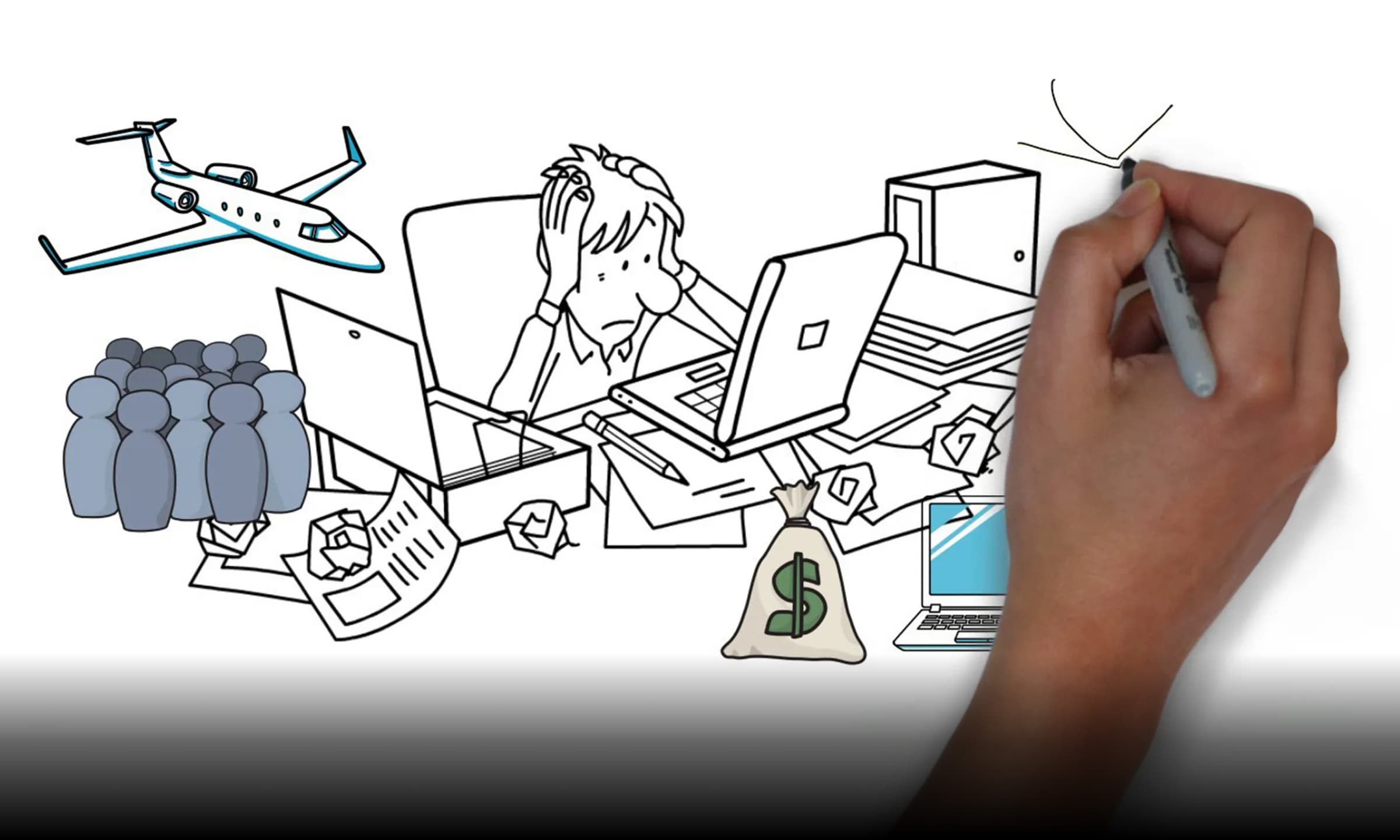
The product we inherited
Eighteen years of accumulated interface. Users spent most of every day entering data into it, and over half were abandoning routine tasks partway through.
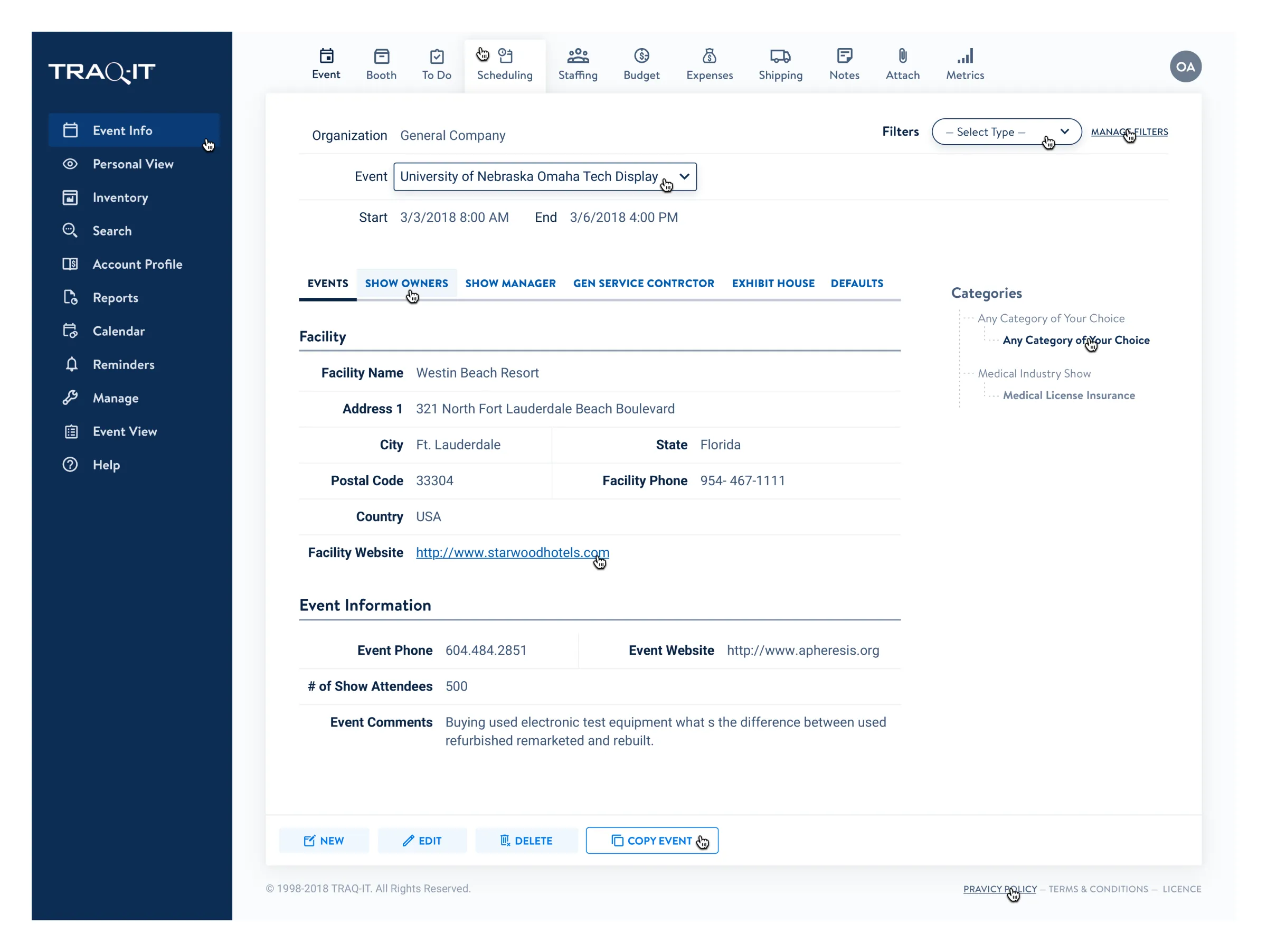
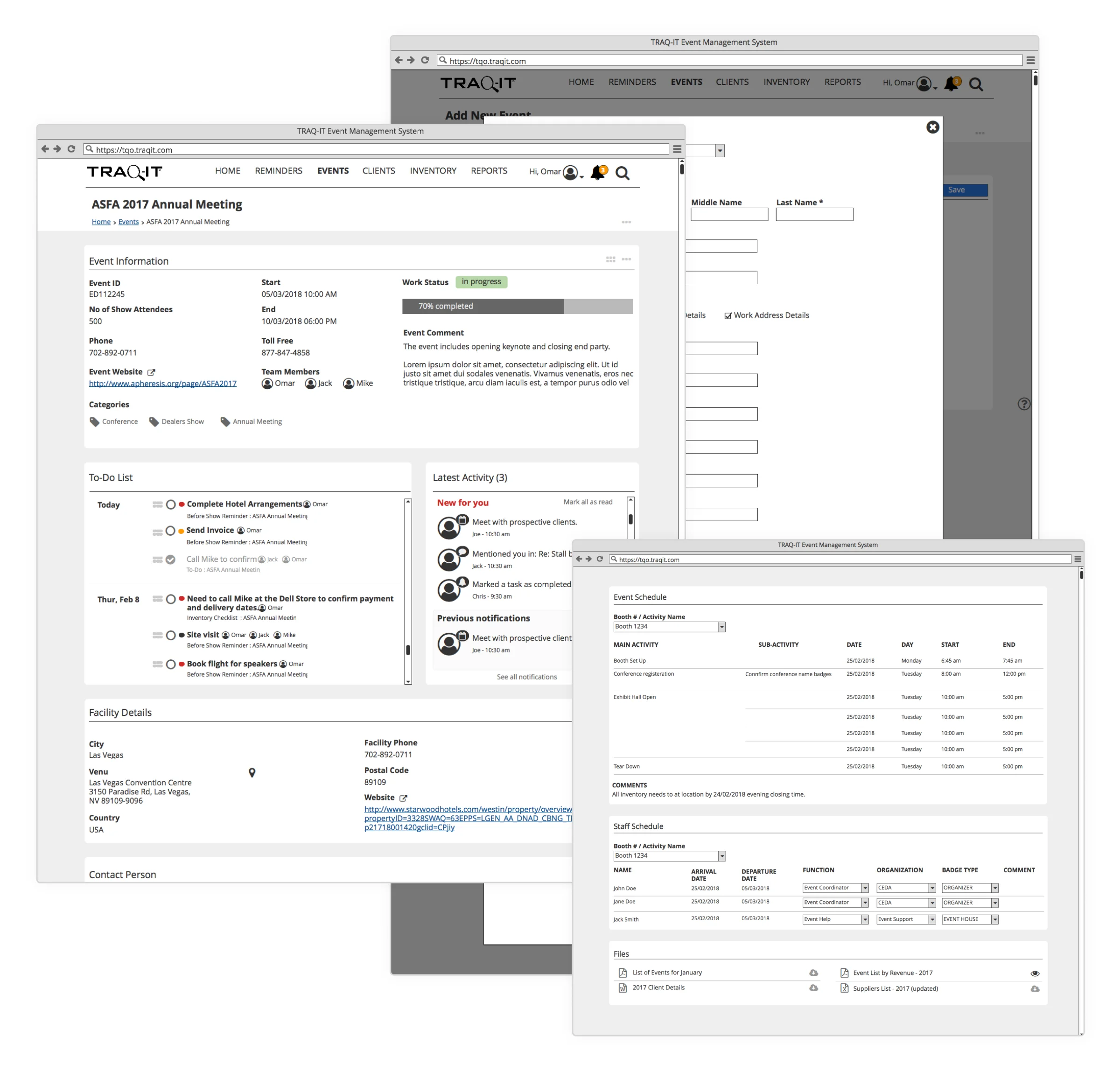
Phase two: a transitional release
Modern components on a layout users already knew. It let a long-standing, often older user base keep working while the product changed under them.
Shortening the flows
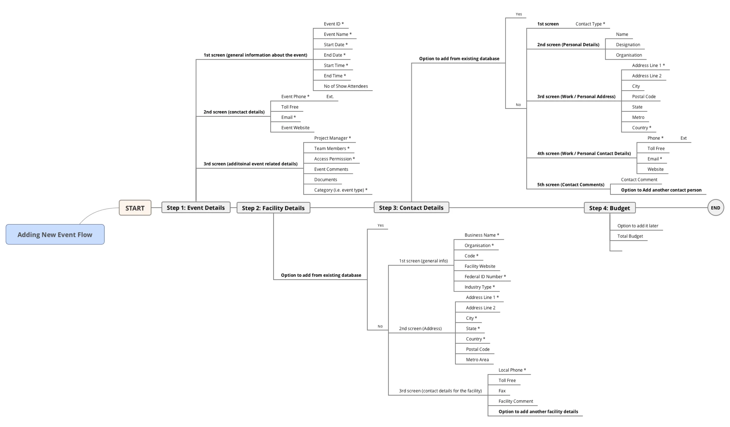
Adding inventory or changing one detail about an event meant crossing several screens. Cutting those steps produced the 38% figure.
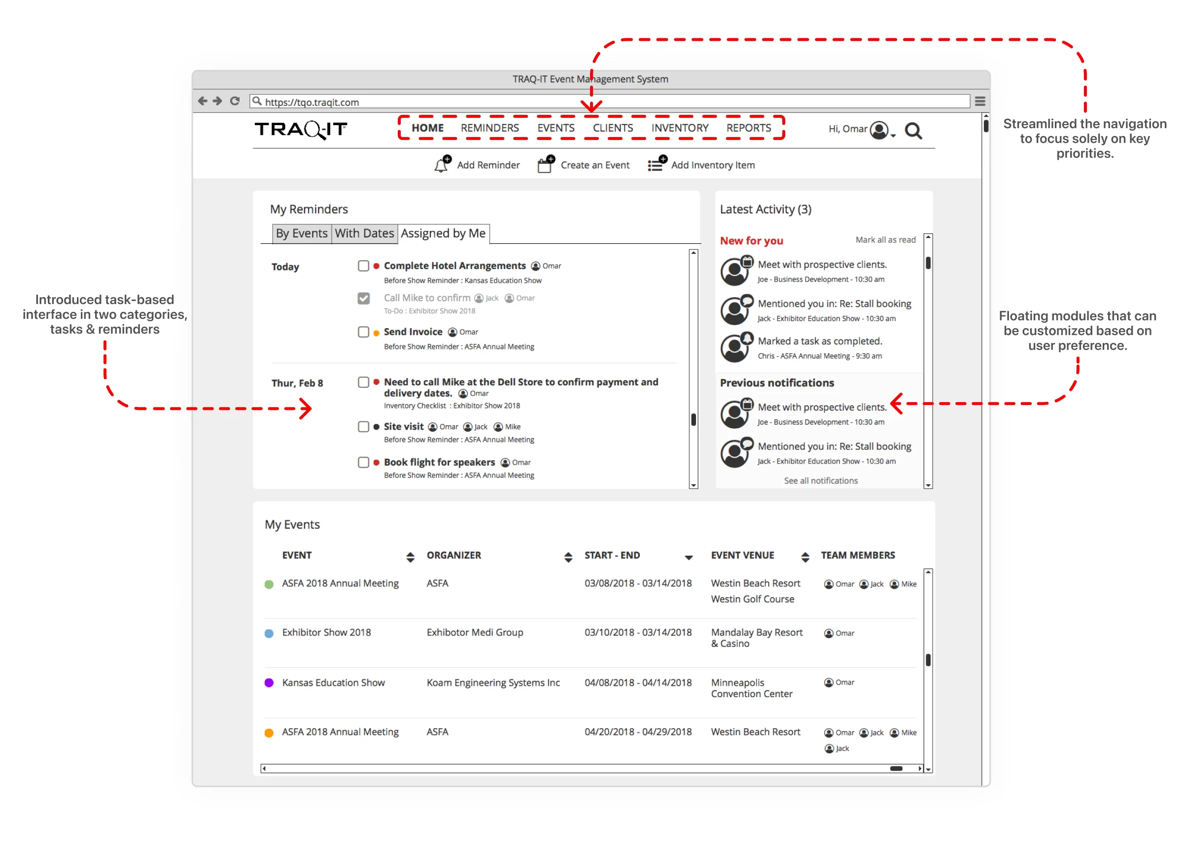
A task-based interface
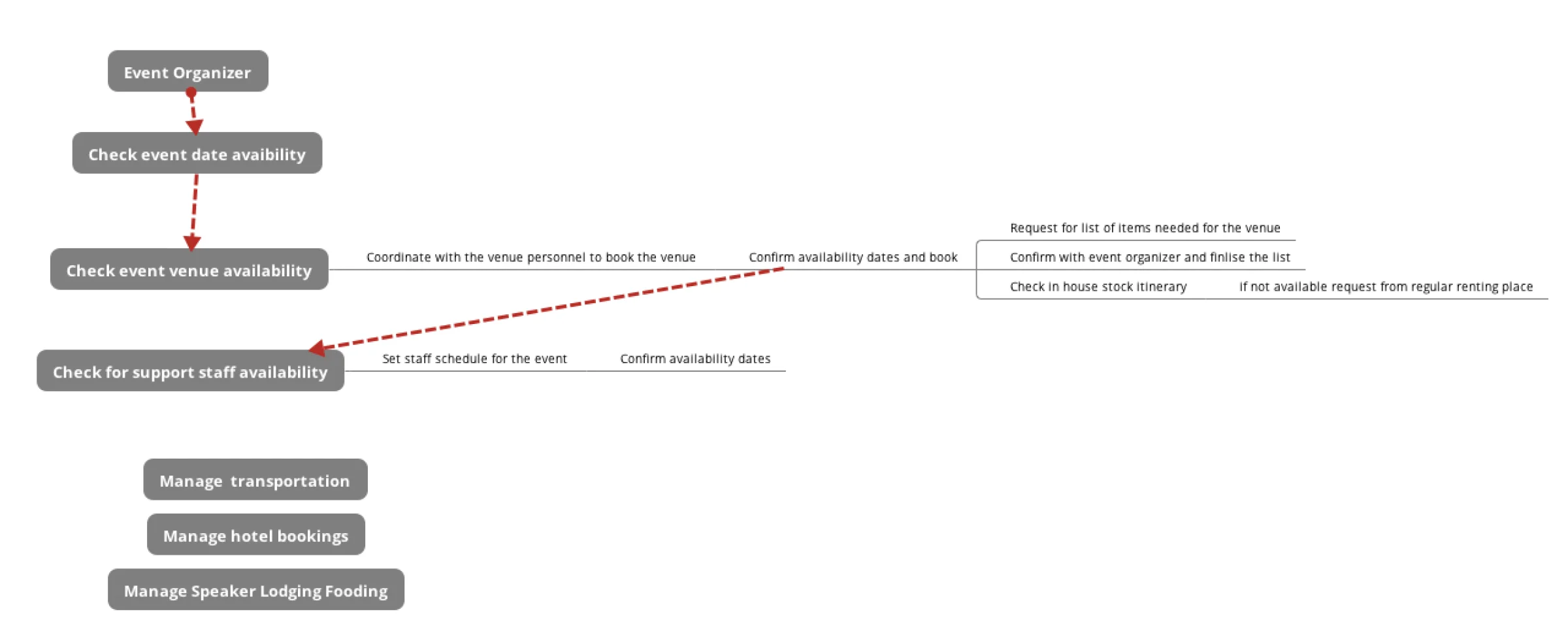
The first concept organized the product around what an organizer is trying to do rather than where the data lives.
What testing changed
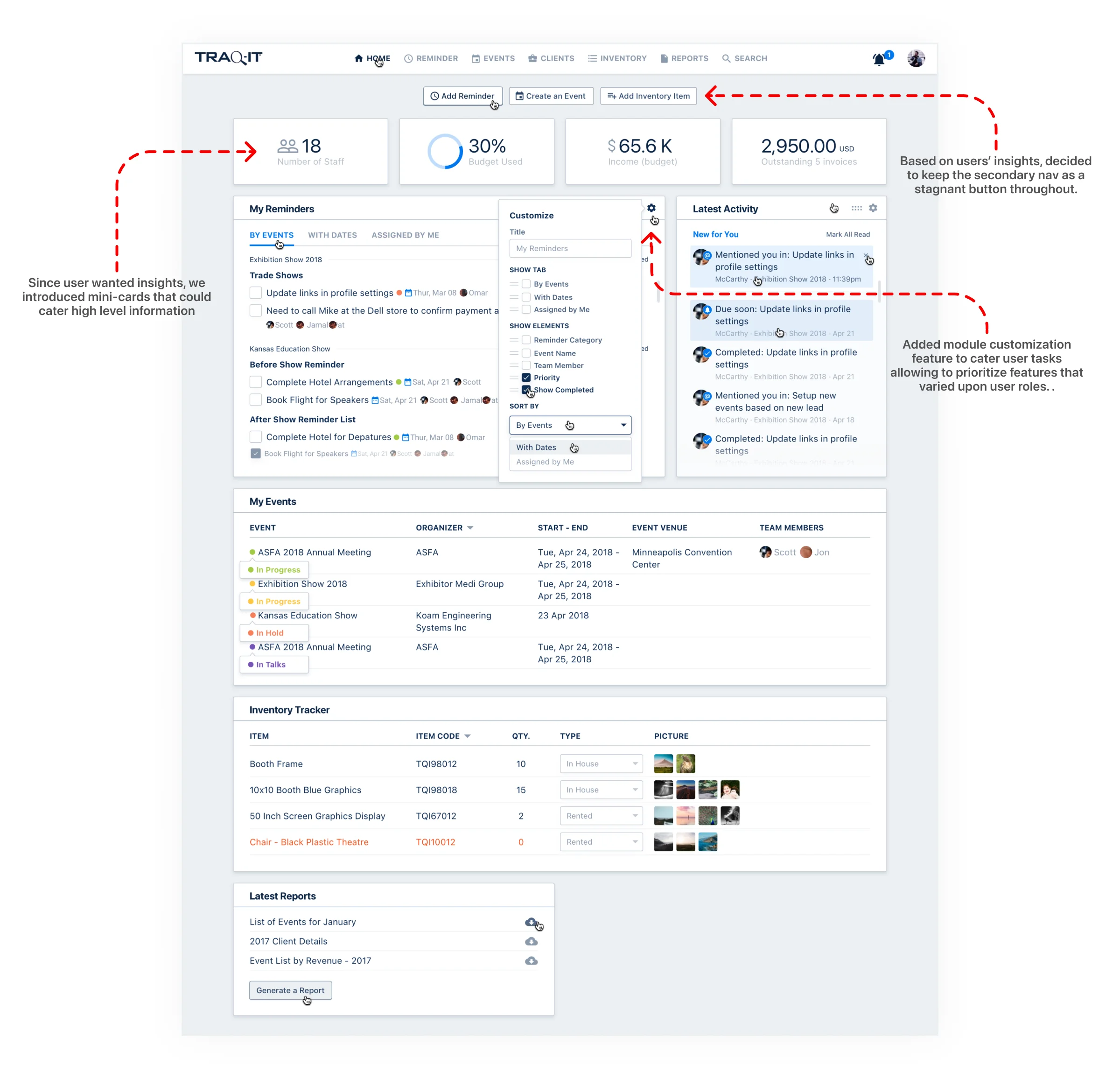
One-on-one sessions over UserTesting.com and Zoom. Users kept asking the same thing: what is happening with my event? That question is why the key numbers moved onto the dashboard, and why left navigation came back after we had removed it.
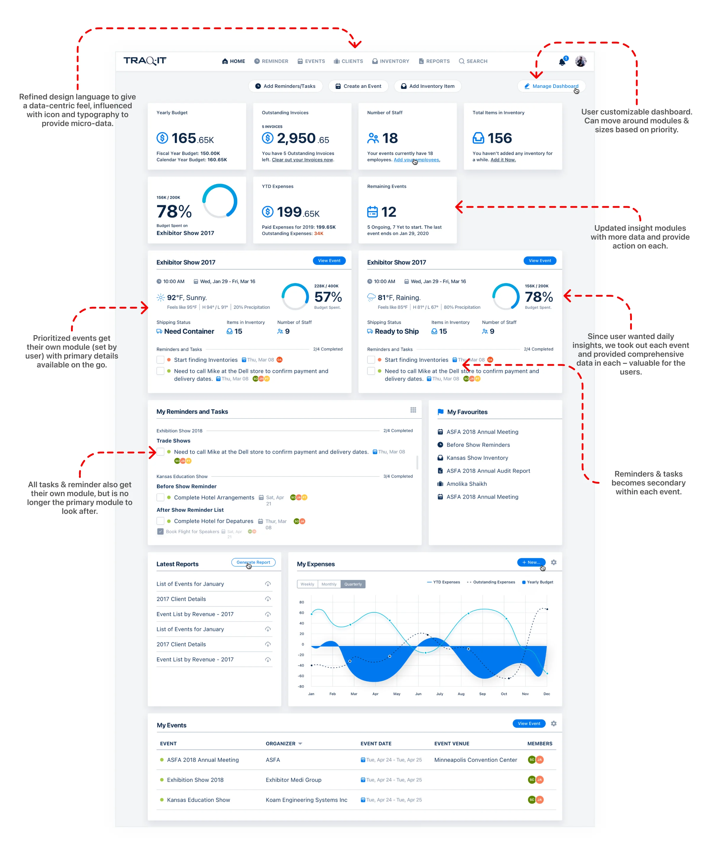
The final design
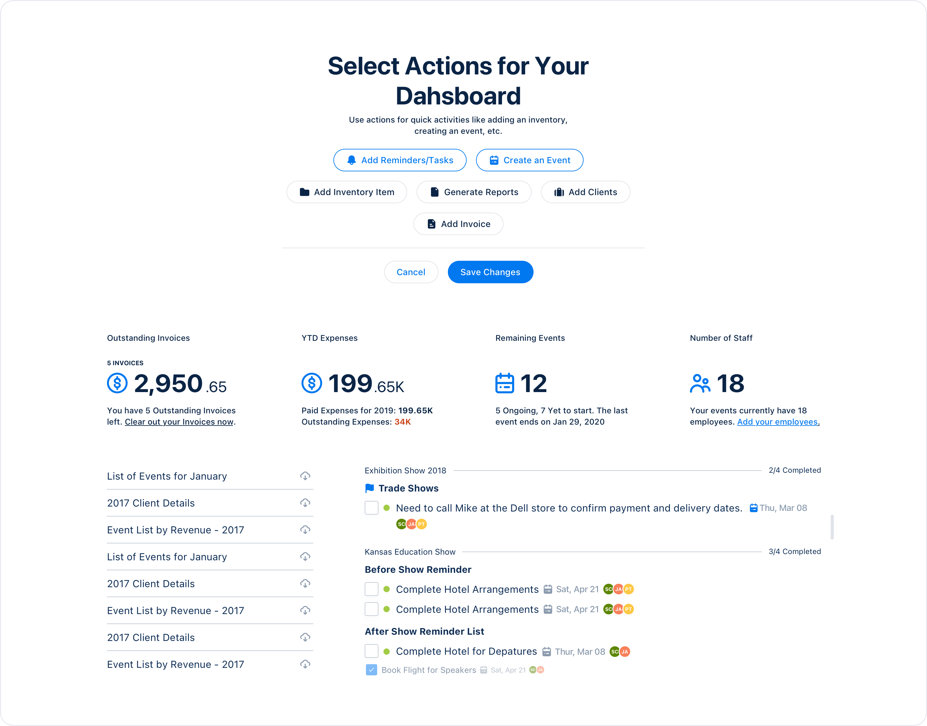
Customizable dashboards, insight cards per event, and the navigation users asked to keep.
The system underneath
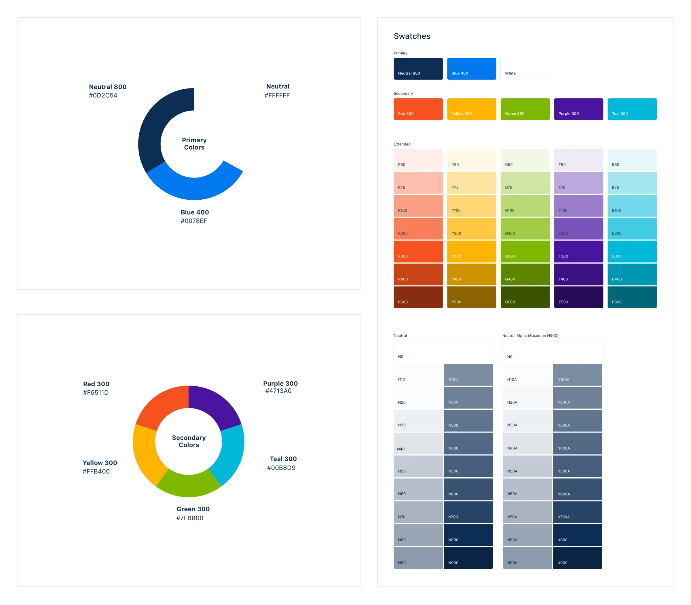
Modular components so the product could keep growing without another layer of patches. Accessibility was built in from the start against WCAG, with high-contrast color and full keyboard navigation.
What TraqIT Got
- Faster daily work. Shorter flows and fewer screens for the tasks users repeat all day.
- A product that could grow. A modular component library, so new features use existing parts instead of adding another layer.
- Users who stayed. A transition built on the layout users already knew.
Results
- 38% less time spent on task creation and event management
- 34% landing page conversion for new users
- Redesigned KPIs made data retrieval straightforward and cut navigation
- 18-year-old product revamped on a modular component library
STACK
- Figma
- UserTesting.com
- Zoom user tests
- WCAG 2.1 guidance
- Modular component system
FAQs
Modernize a legacy product without losing its users.
Tell us what you are building.
A senior person reads every enquiry and replies within one working day.