
The checklist
| Where the brand appears | What to check |
|---|---|
| The logo | Lockups for every background, including one colour |
| Colours and type | Where each comes from, written down once |
| Shared content | Maps, place names, calendars: one source for print and web |
| The same mark and content as the website, checked in proof | |
| The website | Templates that carry the mark, and who keeps them current |
| Everything else | Email signatures, social media profiles, documents, signs |
The first three rows decide the rest. Get them wrong and every later format inherits the mistake.
A mark that carries the region
The logo is built from the region itself. The rectangle is a gateway into the region. The pattern down its left side comes from the carvings found in Tharu homes. Inside stands the swamp deer, the barasingha, now rare across most of its range. The A in "FAR" carries the outline of Mount Api, the region's tallest peak, and the green and blue come from its landscape.
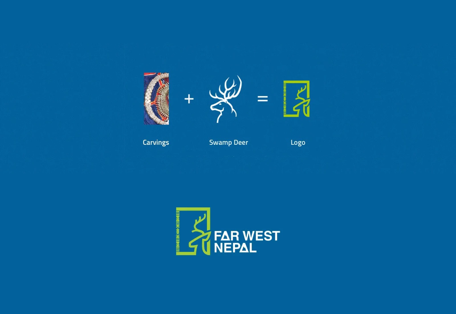
A mark with that much meaning in it needs every later piece to keep it. We drew it in four lockups, reversed on blue, blue, green and black, for light and dark backgrounds and one-colour print.
The map, on paper and on screen
The map became the way in. The website's home page leads with a map of the region's attractions, connecting each name to where it sits before the visitor reads further.
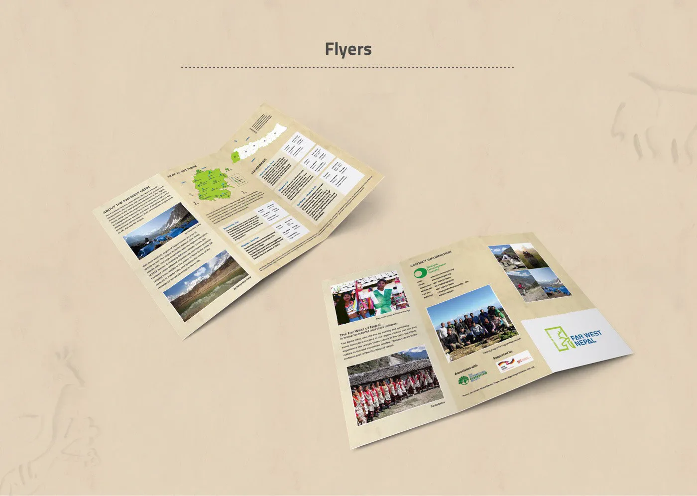
The printed flyers carry the regional map too, with itineraries and practical information beside it. A visitor who picks up a flyer and later opens the site meets the same mark and a map of the same region.
The website, planned like a guidebook
Before the website was designed, wireframes set out its repeating pages: destinations, reserves, trips and a festivals calendar. Planning the structure first gave the content work a clear format.
The website went live in spring 2014. A tour package page and analytics followed that summer. In 2017 we redesigned the home page and inner pages from a new style guide. By 2018 the menu followed the land itself, from the Terai through the middle hills to the Himalayas. The site was live in every yearly capture of the Web Archive from 2014 to 2021.
Why one team
Three suppliers can each do good work and still produce three versions of a brand. The flyer uses one map, the site another, and the logo sits on both as an afterthought. One team can carry those decisions across print and web. If several teams share the work, agree who checks the result.
Three questions before you split the work
- Who holds the mark once it leaves the designer, and who checks it in print and on screen?
- Which pieces share content, such as a map, a list of places or a calendar, and who keeps them the same?
- Who keeps the website current after launch, when the print has already gone out?
The Far West Nepal case study shows the logo, the wireframes, the flyers and the site from 2014 and 2018. We take on identity and design with the website and print in one engagement.
A new logo is the visible part of a rebrand. The checklist is for everything that has to agree with it.