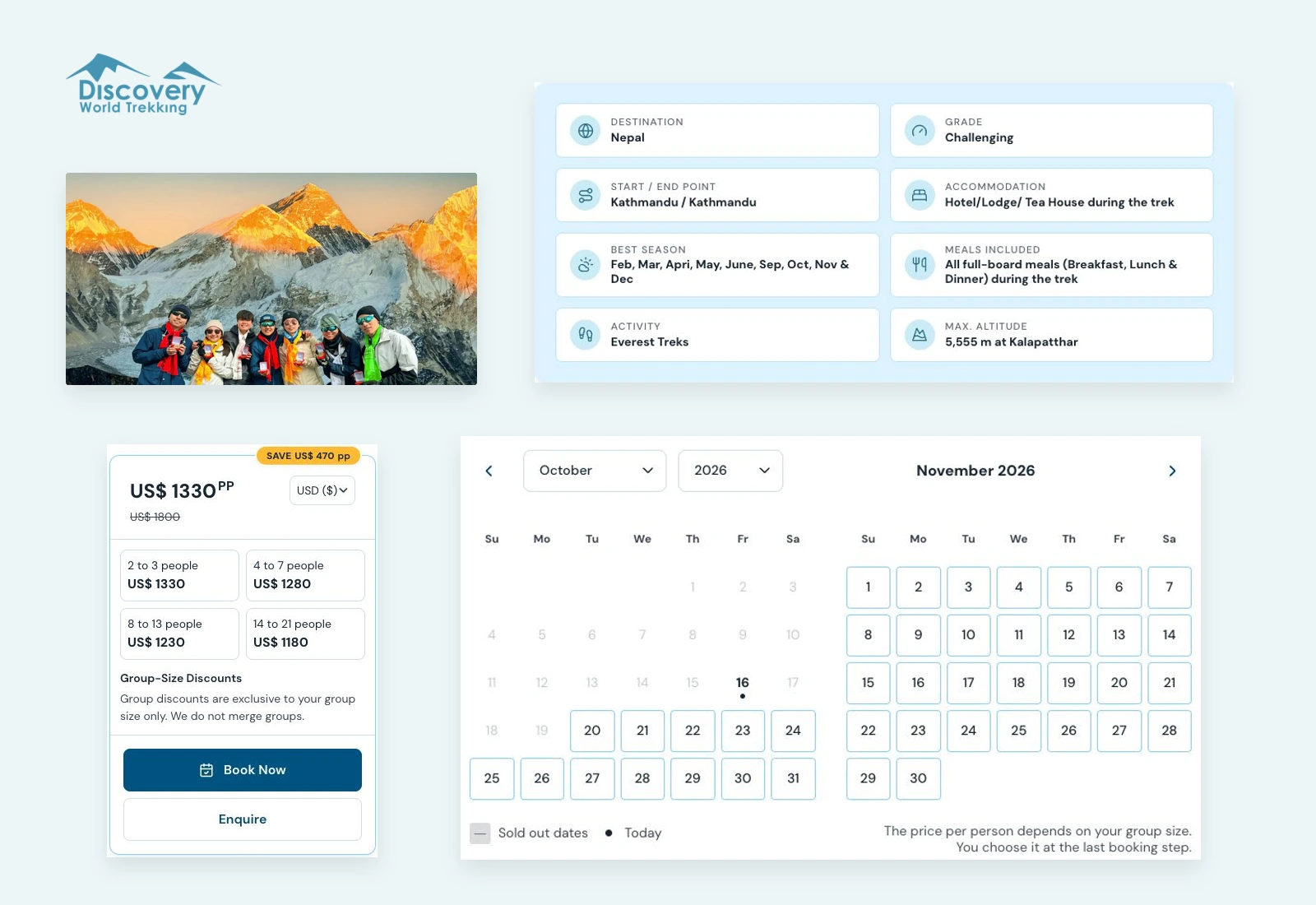
Three versions of the same site
Before drawing anything, we compared the three places the site's design lived: the Figma file, the code and the live pages. They disagreed. The main button was one blue in Figma and another on the live site. The greys in the designs were a navy family, and the code used a stock grey scale. The Figma file held 26 pages, 77 text styles named four different ways and 107 colour styles.

Made one by one, each of the twelve changes would have picked a side in those disagreements without anyone deciding. The changes could have added another set of conflicting decisions.
Decide once, then change
So the first output was a list of decisions, one for each disagreement: which blue is the action colour, which greys belong to the brand, which button is the button. Each decision names its source and its reason. The colours, type, spacing and reusable components grew from that list, and the twelve changes were designed on top.
This is where a running site differs from a new one. A new site establishes its starting point. A running site has travellers who know where the booking button is, and a team that knows how the pages work. The system keeps what works and changes what fails, and it has to say which is which.
Show each part before and after
The case for the changes was a comparison, not a style guide: the live site beside the new foundation. It covers ten parts of the site, from body text and buttons to the trip header, the price sidebar and the WhatsApp button.
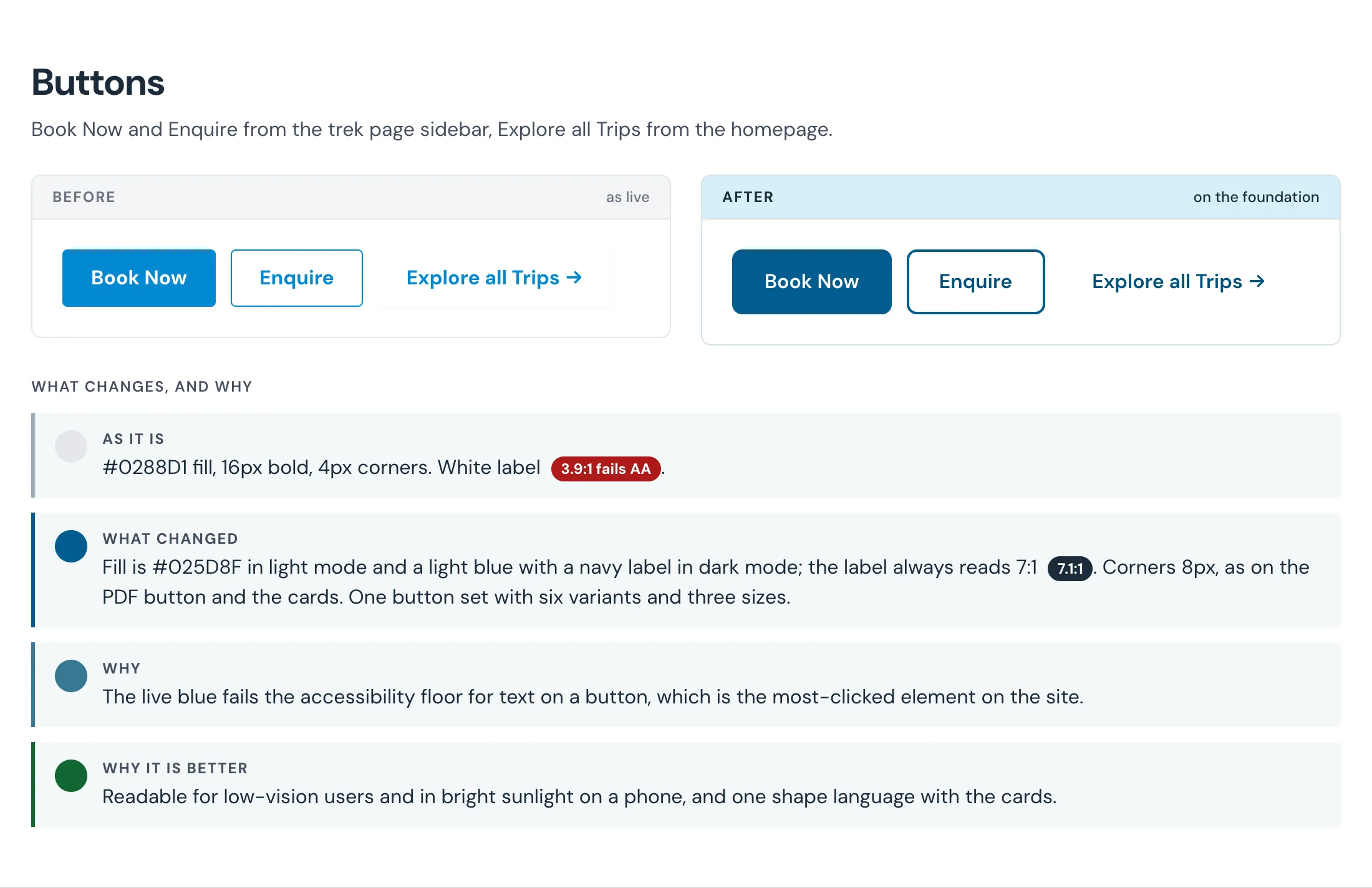
Each part carries its own reason. The Book Now button's white label measured 3.9 to 1 on the live blue, under the 4.5 to 1 that small text needs. On the foundation it reads 7.1 to 1. We also improved the Best Seller badge’s text contrast while keeping its orange colour. Nobody had to argue for a new colour or defend the old one. The before and after made the case.
The comparison also carried what the client had not asked for and needed anyway. The foundation defines text colour pairings and their contrast targets. There is a dark theme, a focus ring for keyboard users, and one set of buttons in place of two.
Into the running site
The design went through rounds of feedback with the client on a preview site, and went live on 16 October 2026. The Discovery World Trekking case study shows the badge before and after, and the booking pages the system now carries.
The next change starts from the system, not from whichever version of the site someone opened first.
A design system for a new site is a set of choices. For a running site, it is a set of decisions about what to keep, and each one has to show its reason.