
Four ideas in one mark for a WordPress and SaaS company.
In 2025 we designed a new identity for Codewing, which makes WordPress themes, plugins and SaaS products: the mark, its colours and type, a 20-page guide and print files.
A software company since 2013
Codewing makes WordPress themes, plugins and SaaS products, among them Rara Themes, Rishi Theme and WP Travel Engine.
What we made
A mark built from four parts, a lower-case name, colours and type. We also made a 20-page brand guide, the logo files for screen and print, and print files for company polos and caps.
From a cube to one mark
The dates come from the project's task list and files. The pictures are our designs and mockups.
A cube logo from 2021
Codewing has made WordPress themes, plugins and SaaS products since 2013. On its website, the logo was a cube with the name in capitals, in use since 2021. In August 2025 Codewing asked us for a brand identity and answered our logo questionnaire.
The logo on Codewing's website, October 2026. View image full size One shape, four parts
Our designer drew one mark from four parts: angle brackets for code, a person leaping forward, wings for lift, and a lightning bolt at the centre for energy. The name is set in lower case, and its g ends in a smile.
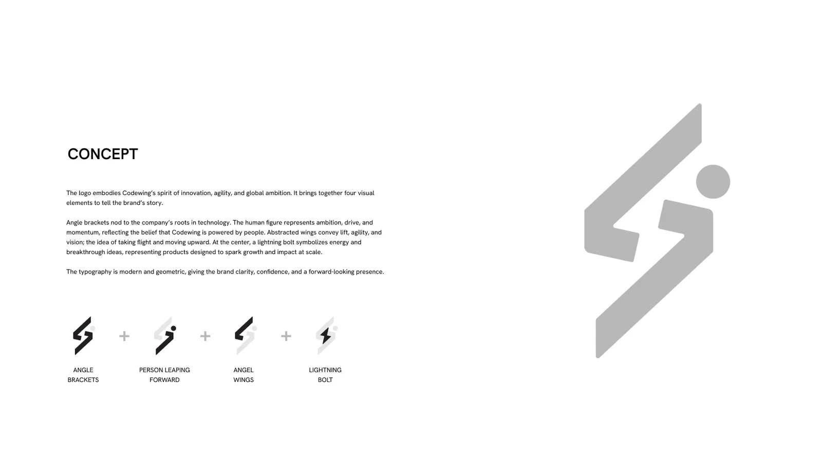
The concept, one part at a time. View image full size Codewing chose the colour
We drew the mark in two colour directions, a blue gradient and a red-orange, then in four more colourways. On the morning of 26 August Codewing asked two questions: could the name stand alone, and what was the g? We explained the smile in the g and how the name could work without the mark. That evening Codewing picked its colour, and we set the final bright blue the next morning.
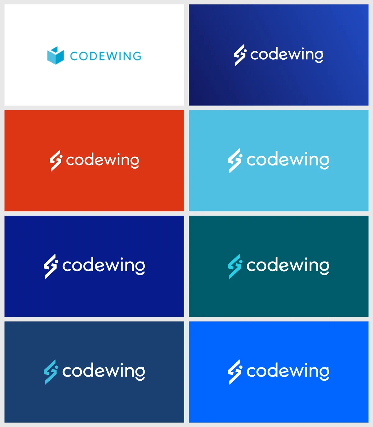
The old logo, the colour directions and the final blue. View image full size A guide the team can use without us
By 28 August the guide had 20 pages. It shows the full logo, the mark and the name on their own for app icons and favicons, the space to leave around the logo, and 8 rules on misuse. It names Hanken Grotesk for headlines and Inter for body text. Every colour has its screen and print values, and the logo files came in colour, black and white, for screen and for print.
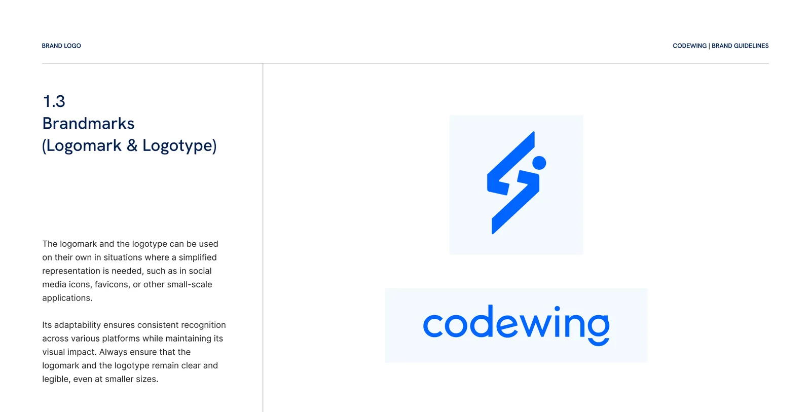
The mark and the name, each on its own. View image full size 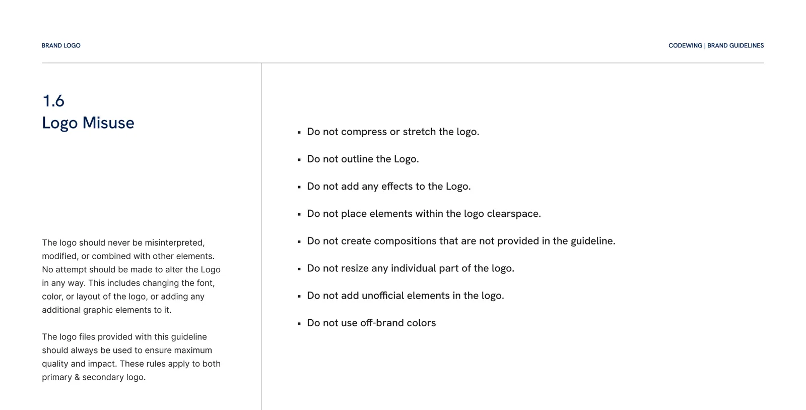
The 8 rules on misuse. View image full size 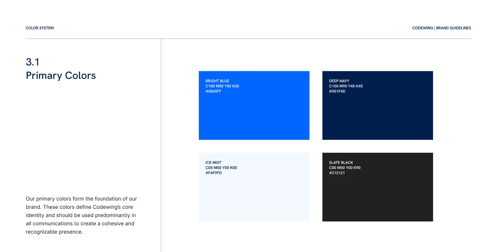
The four primary colours. View image full size On a screen, a phone and a polo
We tried the mark on mockups of an event screen, a phone and a watch. In September we made the print files for company polos and caps, with the mark running large across the shirt.
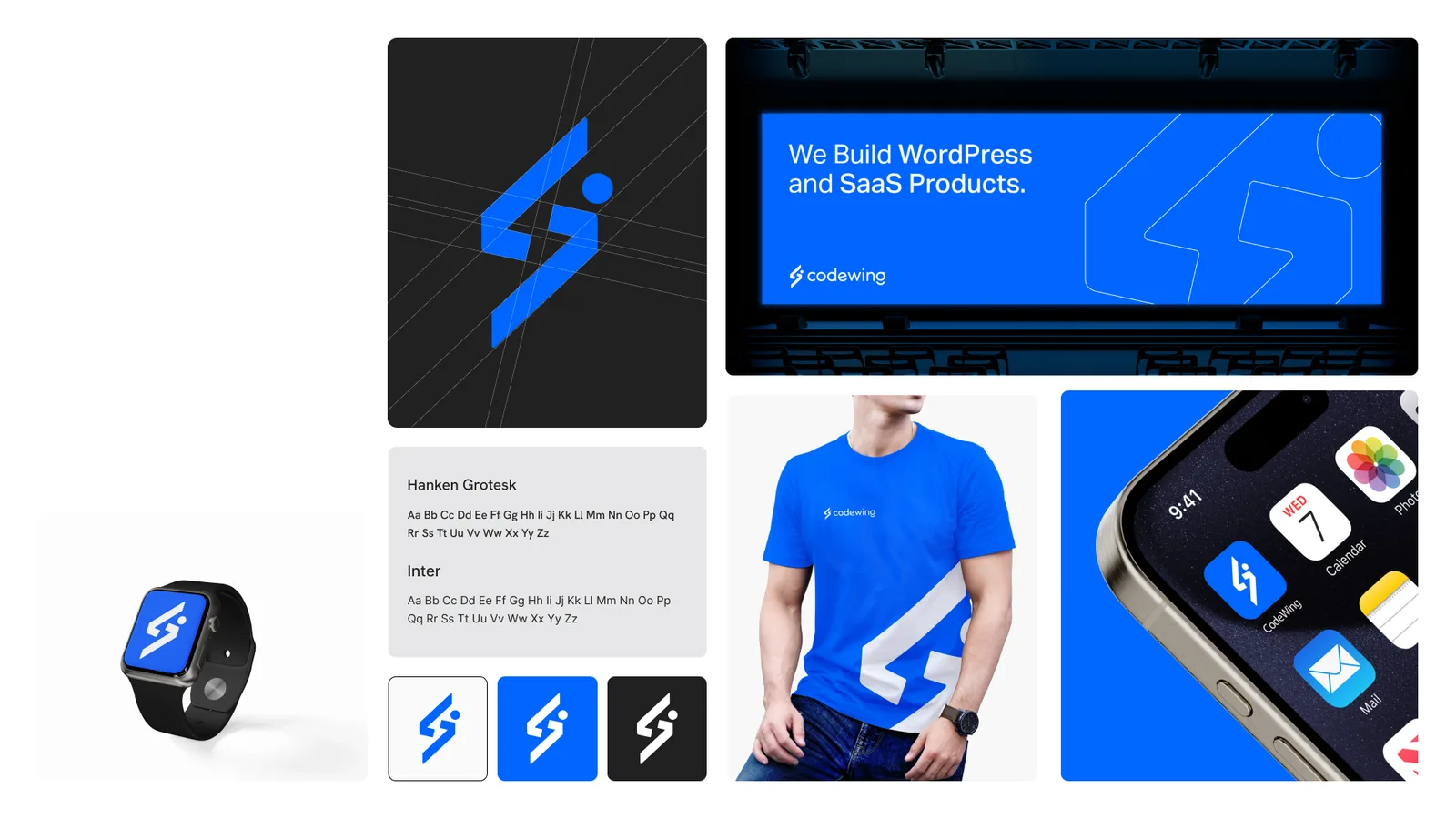
The mark at different sizes and on different surfaces. View image full size 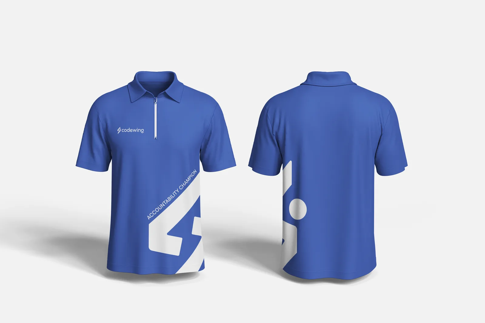
The company polo mockup, front and back. View image full size 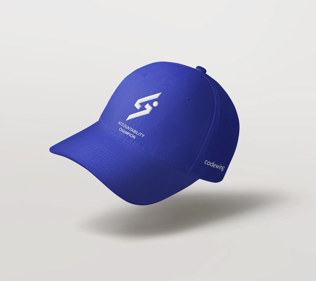
The cap mockup, with the name on the side. View image full size Where it stands
The logo set, the guide and the print files were all delivered by 19 September 2025. On 23 October 2026, Codewing's website still showed the cube logo.